2025
RoutePal: turning group chaos into clarity
context
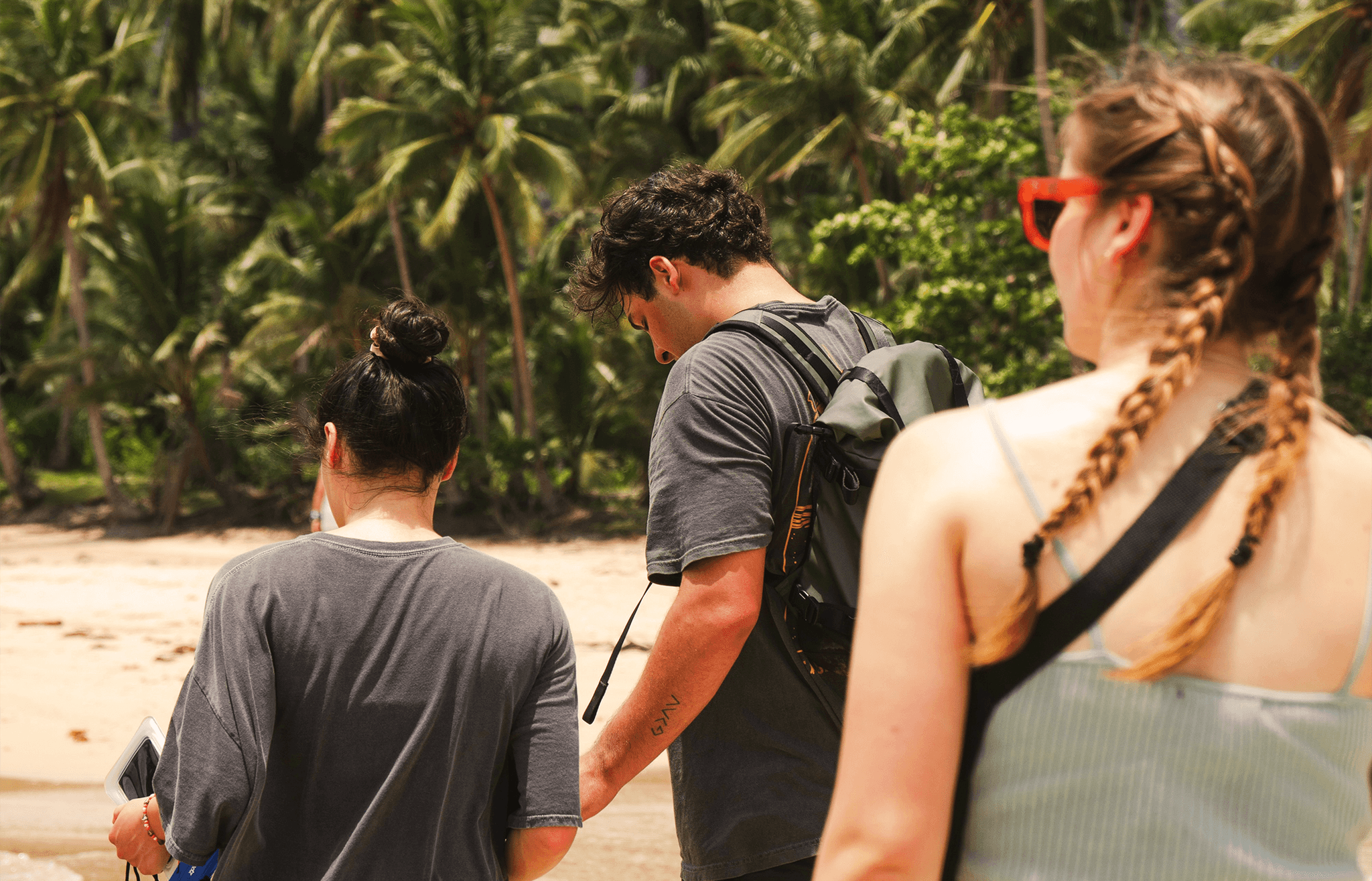
The everyday friction of group travel
After a long day of sightseeing, no one wants to manage logistics. RoutePal is designed to reduce that tension — helping groups quickly vote, decide, and move on with the evening.
contributions
My role in the project
•
Ran competitor analysis
•
Created personas and journey maps
•
Identified key frustrations
•
Built early flows and UX solutions
pain points
What was broken
I mapped out recurring pain points that made group coordination a mess.
Coordination overload. No one knows what the plan is. Details are scattered across chats, notes, and apps.
→
Slow, unclear decision-making. One person takes the lead. Others delay or disappear.
→
Splitting bills is still awkward. People avoid talking money. One pays, then messages like “send me €17.42?”
→
user research
Who we designed for
The group travel app RoutePal will help users plan shared activities and manage trip expenses with less friction (goal). This will benefit travel groups with different levels of involvement (object), including proactive planners and casual participants, by reducing coordination overhead and improving decision-making mid-trip. We will do it using features like quick polls, real-time itinerary updates, and simple cost-splitting (action). We will measure success through time-to-decision metrics, user retention, and satisfaction ratings (target).
To reflect real group dynamics, I built three key Personas:
Ari the Organizer: initiates plans but doesn’t want to chase replies
Ren the Active Participant: wants clarity, not control
Nic the New Friend: unsure how to join in


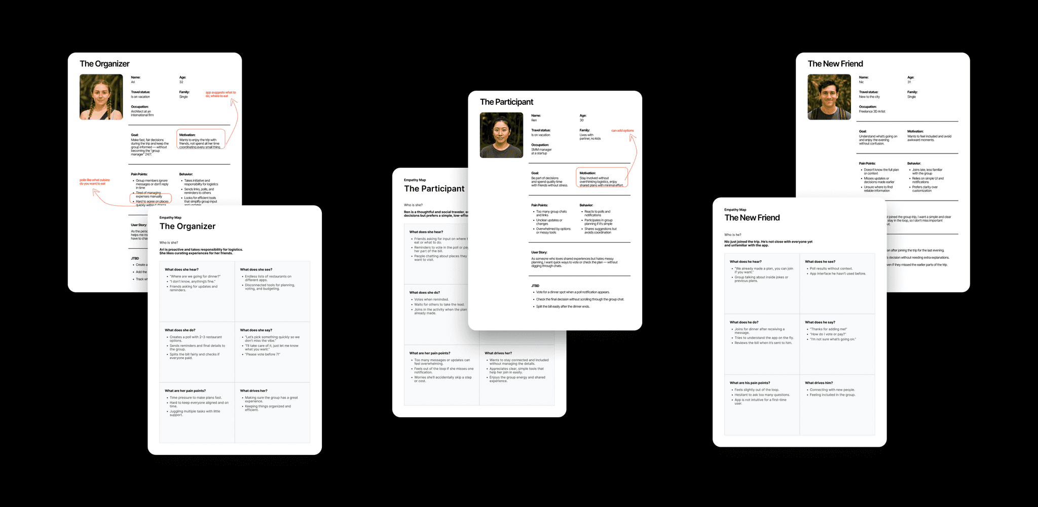
Each person had different needs when it came to group planning. Using the Jobs to Be Done (JTBDs) approach helped me focus on what really matters to them — and turn those needs into clear design priorities.
Here’s what each person is trying to do:
Ari: “When I suggest dinner, I want to get quick decisions and lock it in.”
Ren: “When I see a plan, I want to respond in one tap and feel included.”
Nic: “When I join late, I want to catch up and know where to be.”
These simple goals helped shape the main features of the app.
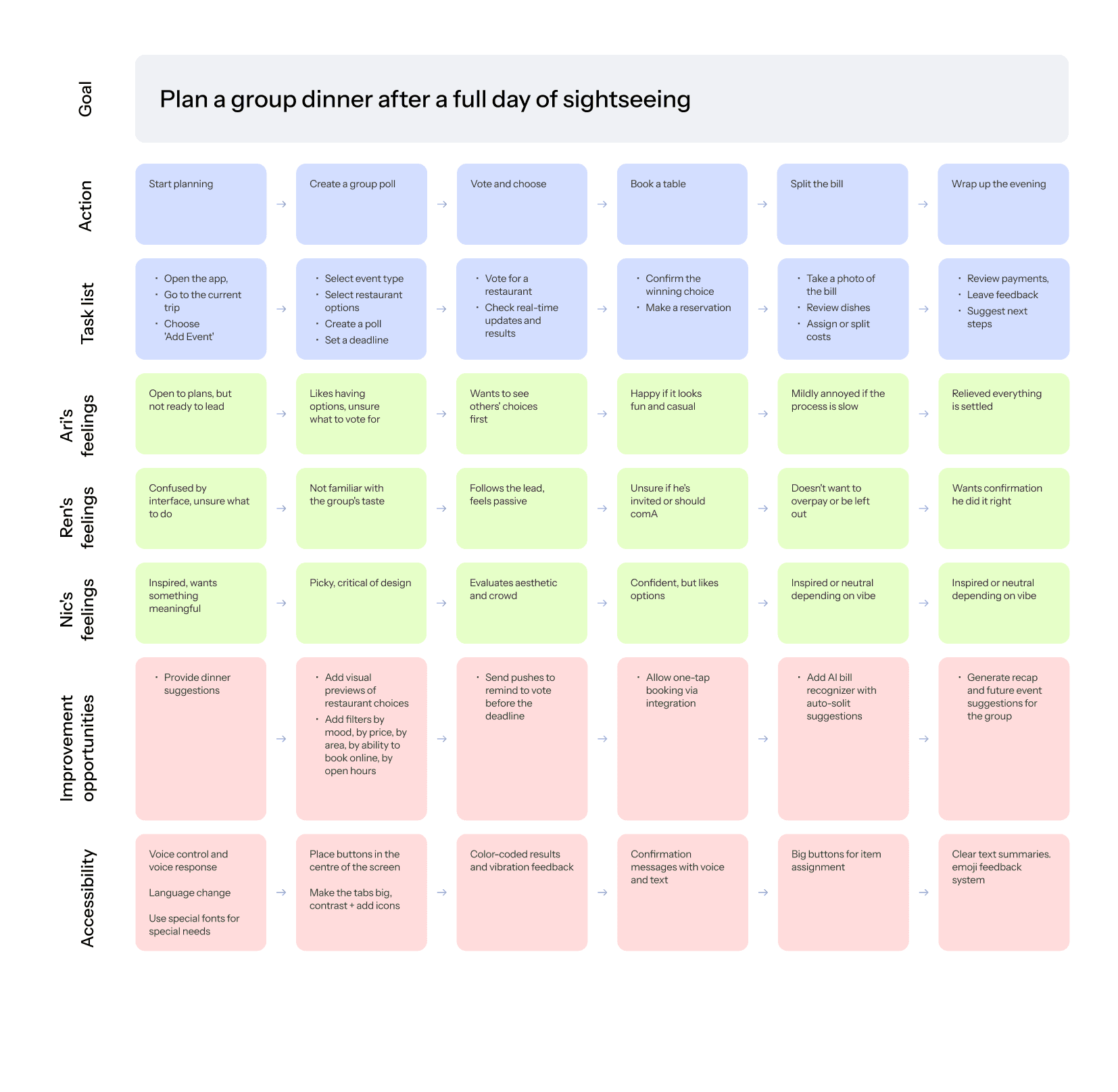
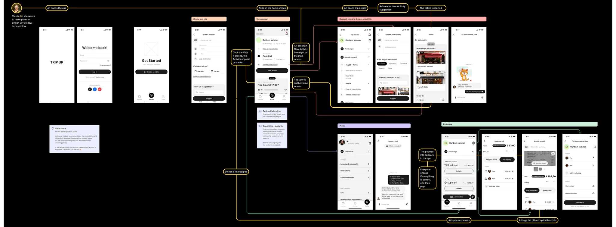
To make sure the flow matched their real-world context, I mapped out a Customer Journey Map (CJM) focused on one key moment: planning a group dinner after a full day of sightseeing.
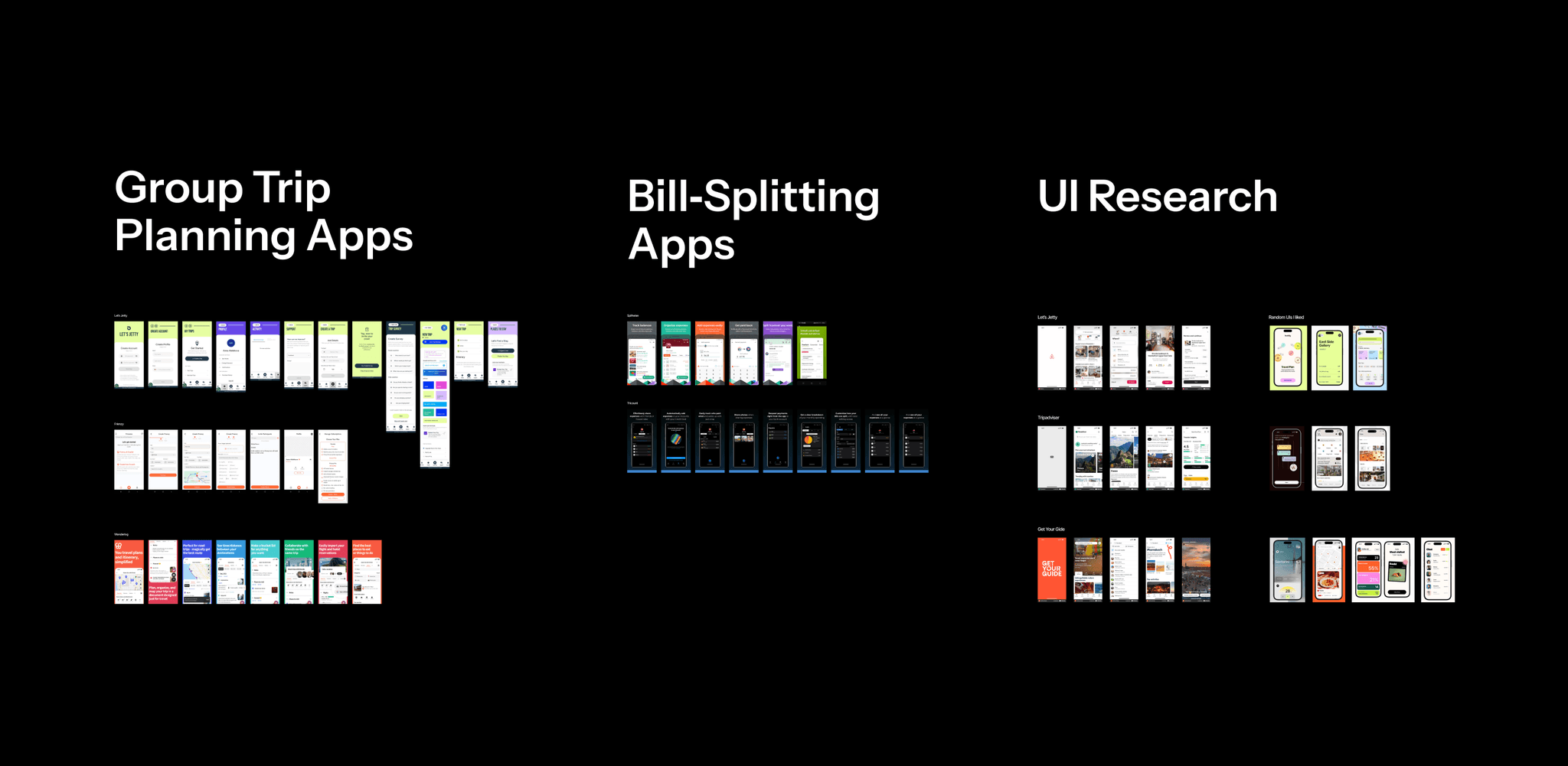
Competitive Landscape
Before jumping into design, I ran a quick audit of existing tools people use while traveling in groups — from expense splitters like Splitwise and Tricount to experience-focused apps like Airbnb and GetYourGuide.
None of them really supported the full journey — suggesting ideas, making decisions, and settling up — in one place. That was the opportunity.
architecture
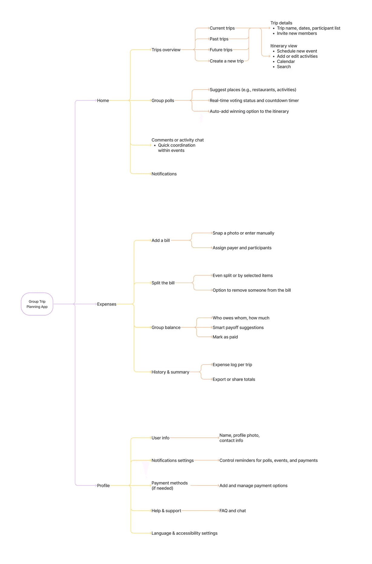
Once I had clarity on user needs, I started mapping out the product structure.
I began with a mind map to capture the key flows: voting, scheduling, and expense tracking.
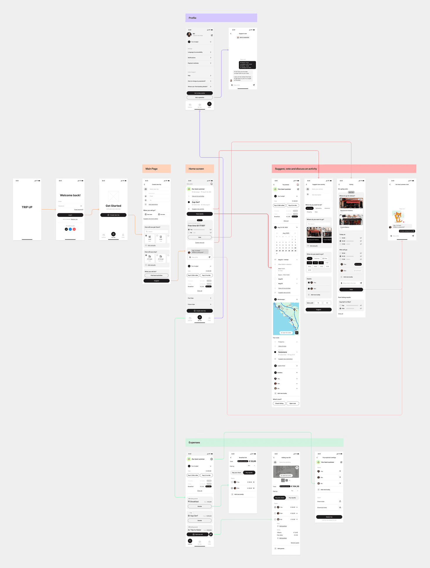
I structured the app into three clear zones:
🧳
Trips (timeline of plans)
💸
Expenses (everything tracked in one place)
🛠
Profile (settings)
wireframes
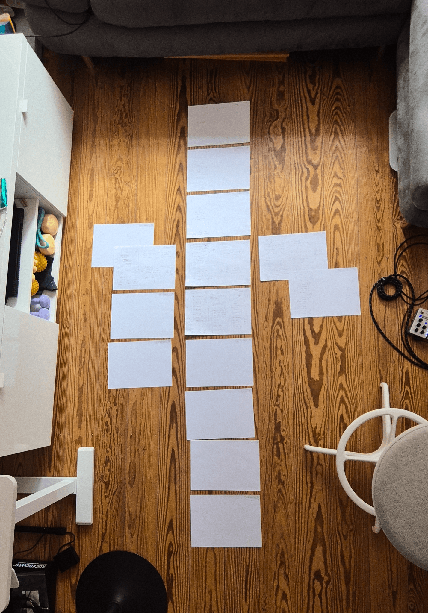
Based on that, I explored the main interactions using quick paper wireframes. This helped me think through layout, flow logic, and screen priorities before jumping into Figma.
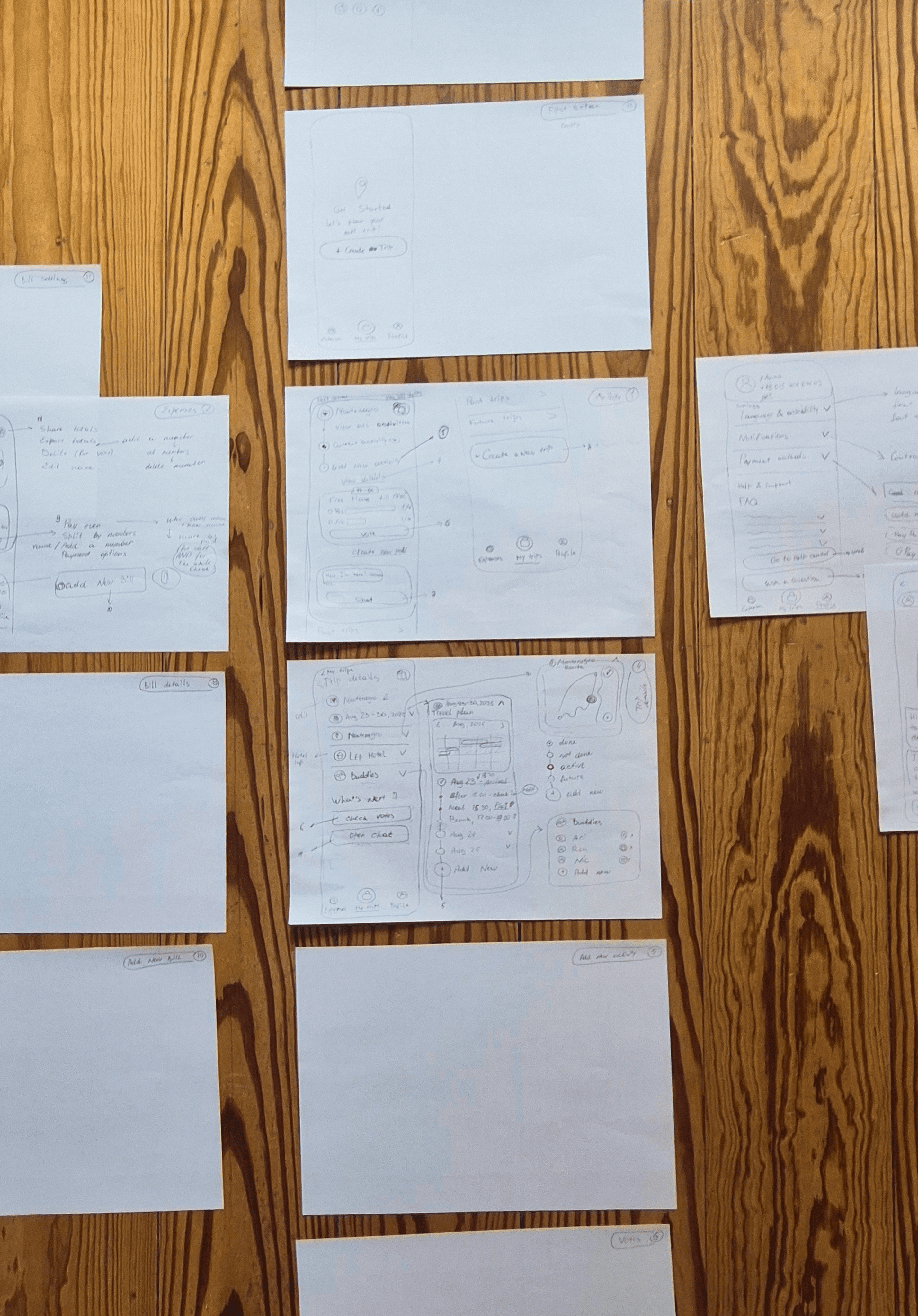
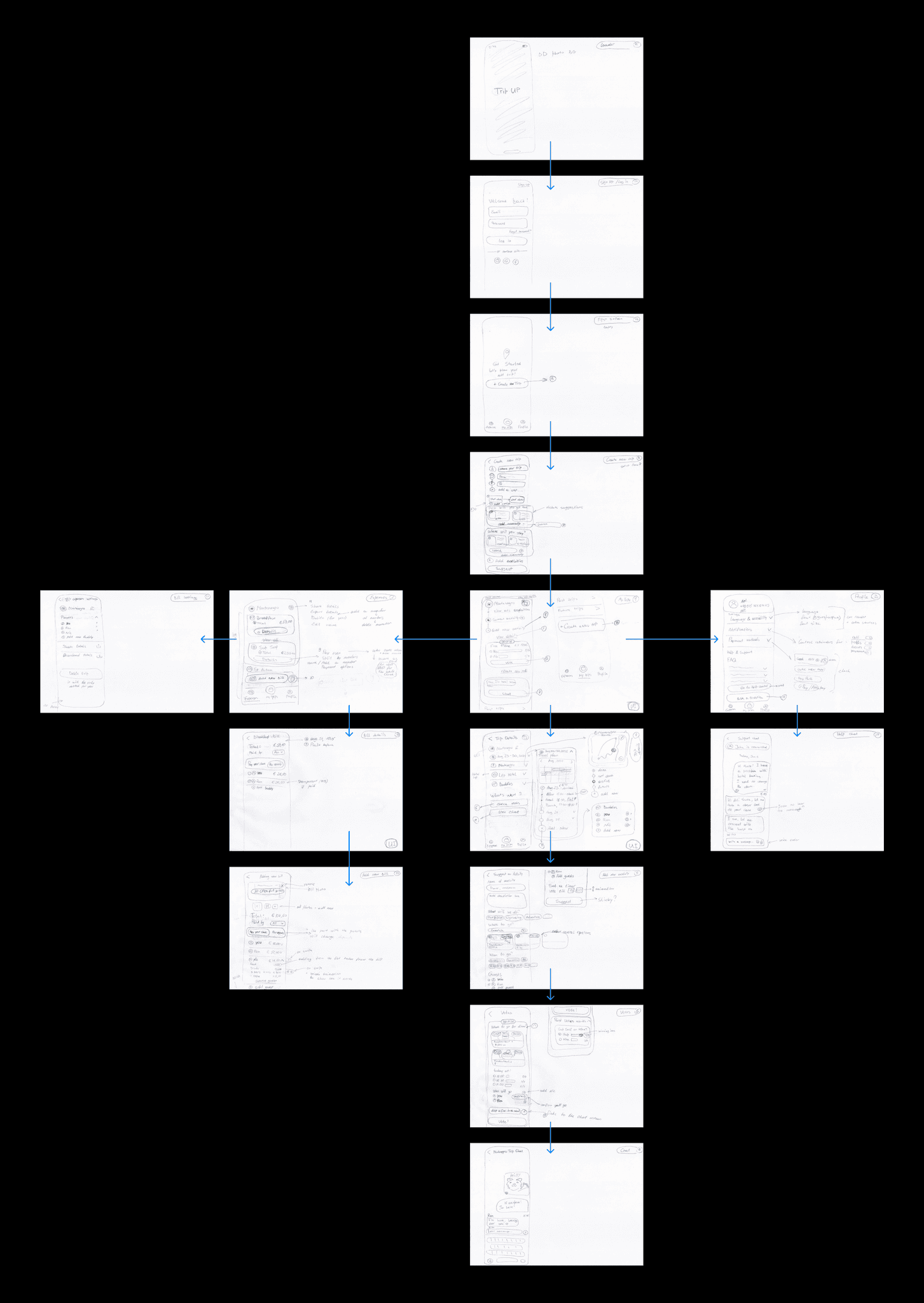
To keep the user journey consistent across the experience, I mapped the Customer Journey directly onto the wireframes — making sure every screen reflected a real step, goal, or pain point from the trip.
This helped me stay focused on what users actually need in the moment, not just what looks good on a flowchart.
visual direction
Setting the visual direction
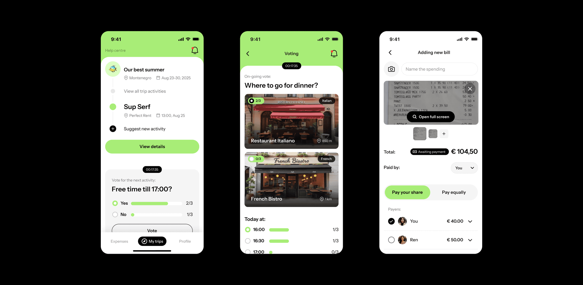
To guide future UI development, I designed three high-fidelity screens: the group poll, the shared itinerary and the expense-splitting flow.
These examples show how the visual language could evolve — minimal, clear, and bright.
results
What this work unlocked
By turning fuzzy ideas into structured journeys and clear screens, I helped the founder move from “I have an app idea” to “I know what to build next.”
This foundation saves time and guesswork during development — and sets the stage for measurable results. With the right product analytics in place, we could track:
📶
How many users complete a poll
📶
How fast groups reach a decision
📶
How often the bill-splitting flow is used
The next step?
→
Test the prototype with real users
→
Add onboarding and notifications
→
Expand the design system based on new scenarios
Good UX means fewer delays, clearer decisions, and less friction between friends — and that’s the kind of value RoutePal was built to deliver.