2025
context
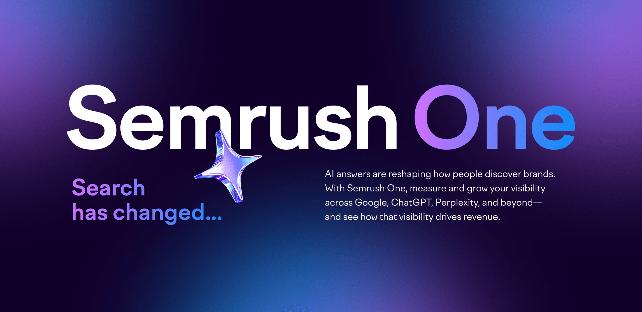
Main message:
my role
My Role in the Project
As a Senior Web Designer, I was responsible for the visual and structural design of the main campaign page and the coordination of all connected web updates.
Key areas of ownership:
•
Designed and structured the main brand page
•
Updated 7 product pages
•
Added promo elements on 5 product pages
•
Designed a new block for the Semrush homepage
•
Curated 2 freelancers
•
Led the UI direction across 30 branded UIs (static and animated)
•
challenge
Constant Changes
The campaign evolved dynamically—both messaging and art direction changed several times during production.
This meant:
•
Rapid iterations of both copy and design
•
•
Keeping visual consistency between multiple teams and assets under tight deadlines
design goals
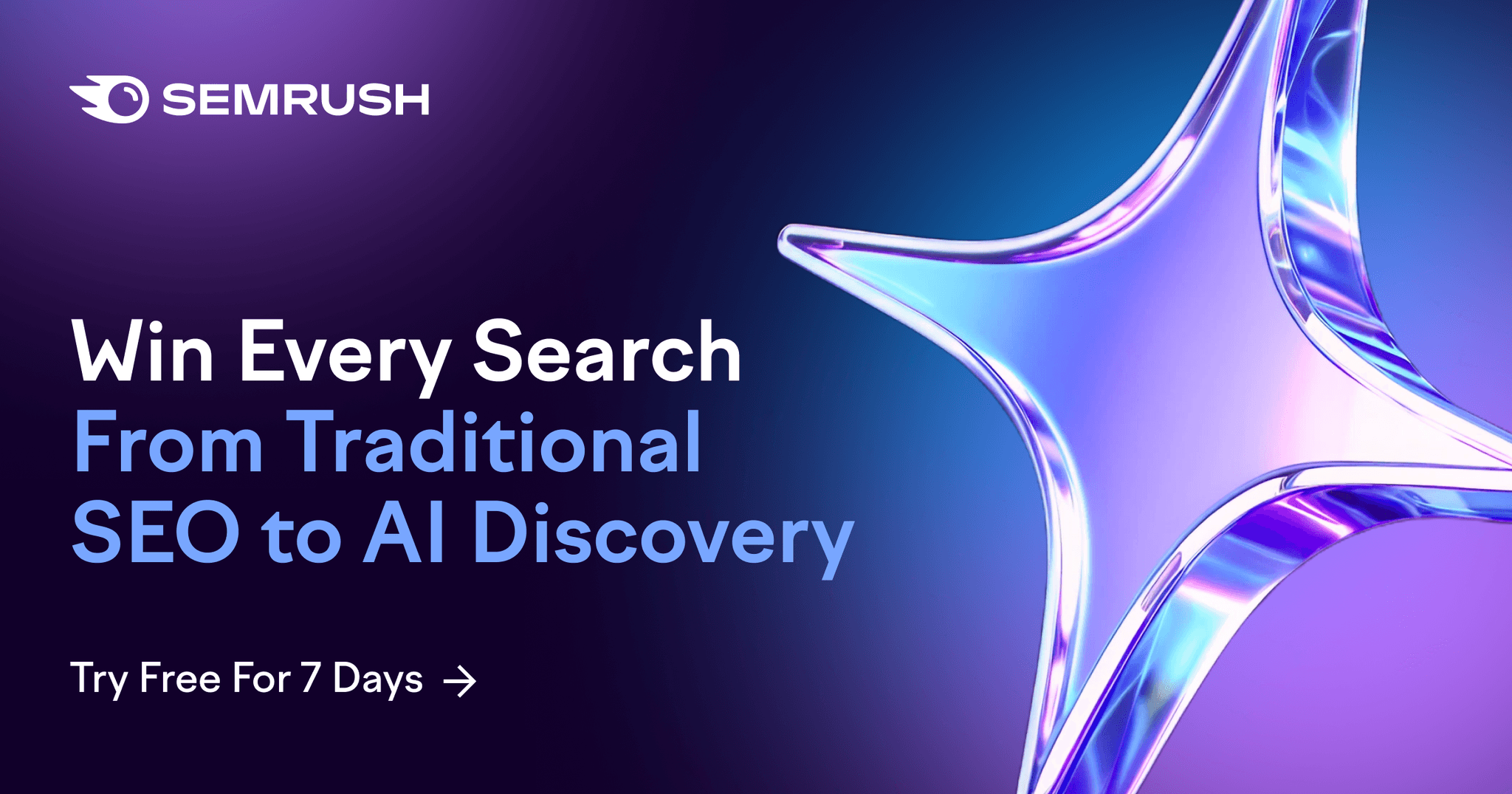
Connect Two Worlds
Visual goal:
Create a transition from dark → light, reflecting the shift from brand to product.
Dark section: mirrors the visual style of the campaign video (bold, energetic, cinematic)
Light section: aligns with Semrush’s product design system (clean, structured, focused)
The brand video
—————
The landing page acts as a bridge between emotional storytelling in the brand video and functional interaction with the product platform
—————
The product platform
design process
Step 1
Structure & storyline
I built the page as a narrative journey—from emotional impact to product value.
It begins with a dark, cinematic section inspired by the campaign video, creating an immediate visual link and emotional pull. As the story unfolds, it transitions into a light, product-driven section, where clarity, usability, and conversion take center stage.
This contrast helped connect storytelling and functionality while maintaining one cohesive experience.
Step 2
Collaboration & iteration
The campaign evolved quickly—both in message and direction.
I worked closely with brand, marketing, content, and development teams to refine copy, maintain consistency, and deliver fast iterations. Together with developers, we implemented smooth on-page animations and tested new web technologies to achieve a modern, fluid experience.
Focus areas:
Copy refinement to support visual hierarchy and storytelling
Advanced animation experiments for performance and engagement
Step 3
Responsive experience
leading the UI direction
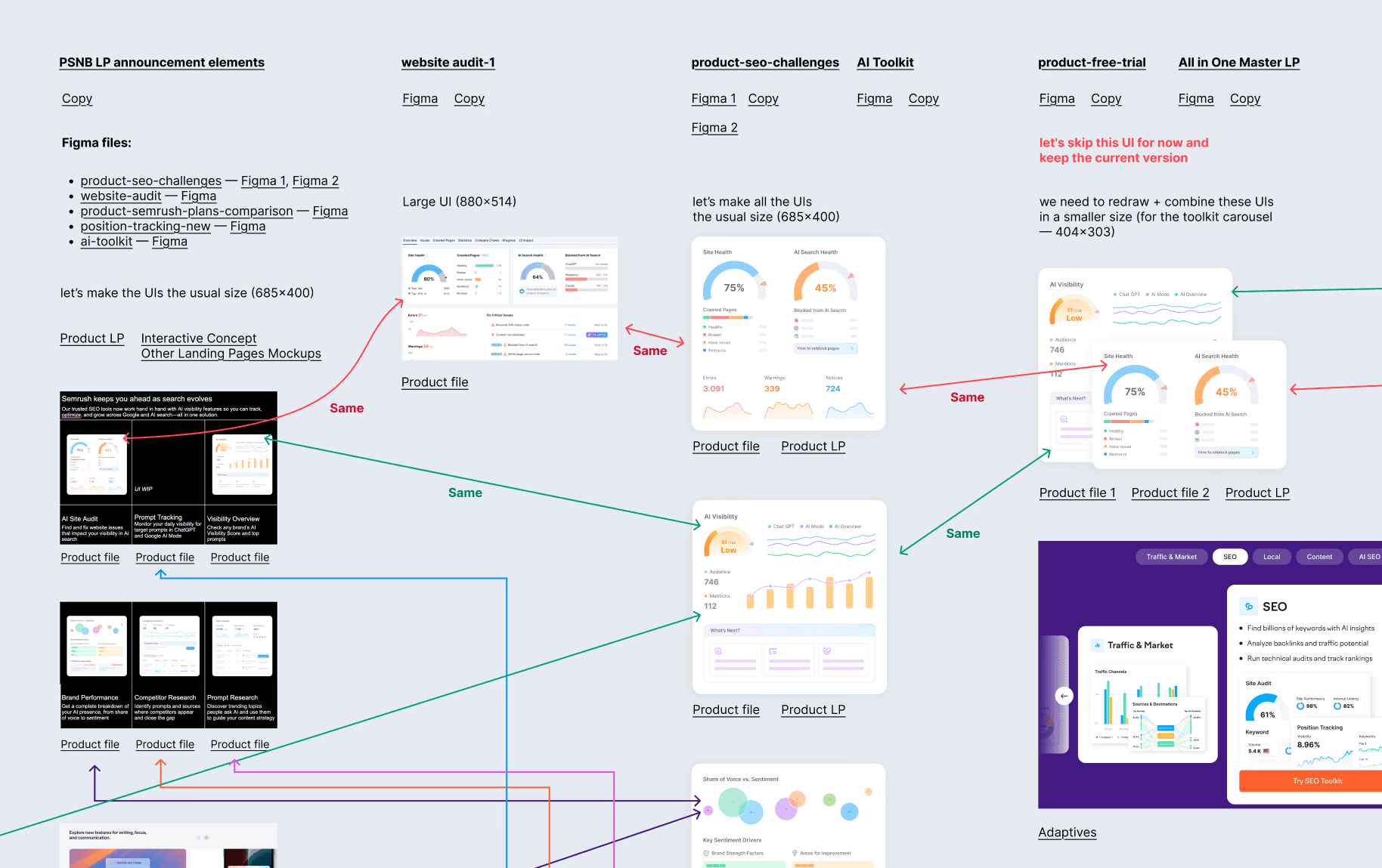
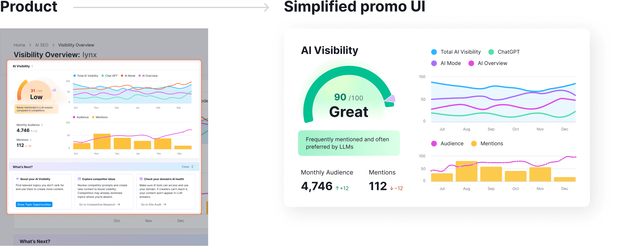
When the campaign started, the UI assets were a complete mix—dozens of disconnected fragments coming from different stakeholders, products, and teams. Each piece looked and felt different, and there was no clear logic behind how they should work together.
I took ownership of bringing order to this chaos. I collected all available UIs, analyzed their structure and purpose, and compared them with the actual product interfaces and marketing content across all campaign pages. This deep analysis helped me identify common patterns, eliminate unnecessary complexity, and define a unified approach that made further design work faster and more consistent.
After building this foundation, I distributed tasks among three core teams—motion, brand, and web—and coordinated two freelancers. Each group received clearly structured UI packages with references and design logic. Throughout production, I supervised art direction and quality, ensuring that all teams stayed visually aligned and that every UI piece felt part of the same design system.
As a result, we transformed a fragmented set of assets into a cohesive, flexible, and scalable UI collection—one that not only supported the campaign but also reinforced Semrush’s overall brand consistency across web and motion experiences.
Hard work close up
results & takeaways
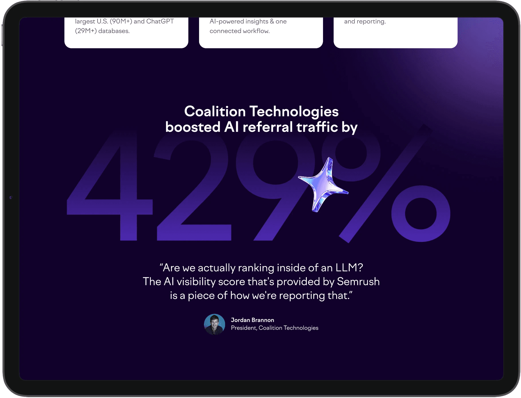
Campaign goals
As a large-scale global initiative, the campaign aimed to strengthen Semrush’s leadership in digital visibility and highlight its readiness for the AI-driven future of search.
Key objectives:
Drive widespread awareness across organic and paid channels during the launch period
Generate notable social engagement and visibility for the Semrush One product
Support growth in recurring revenue
Reinforce Semrush’s brand authority in AI-powered search and digital marketing
Results & takeaways
Although the campaign is still ongoing, it already demonstrated how design can:
Visually connect storytelling and product
Adapt fast to shifting brand strategy
Unite multiple teams and directions under one consistent vision
For me, it was a deep dive into cross-team collaboration, high-speed design iteration, and modern web animation—proving how thoughtful design can drive brand transformation in the AI era.